- admin
- March 30, 2026
- No Comments
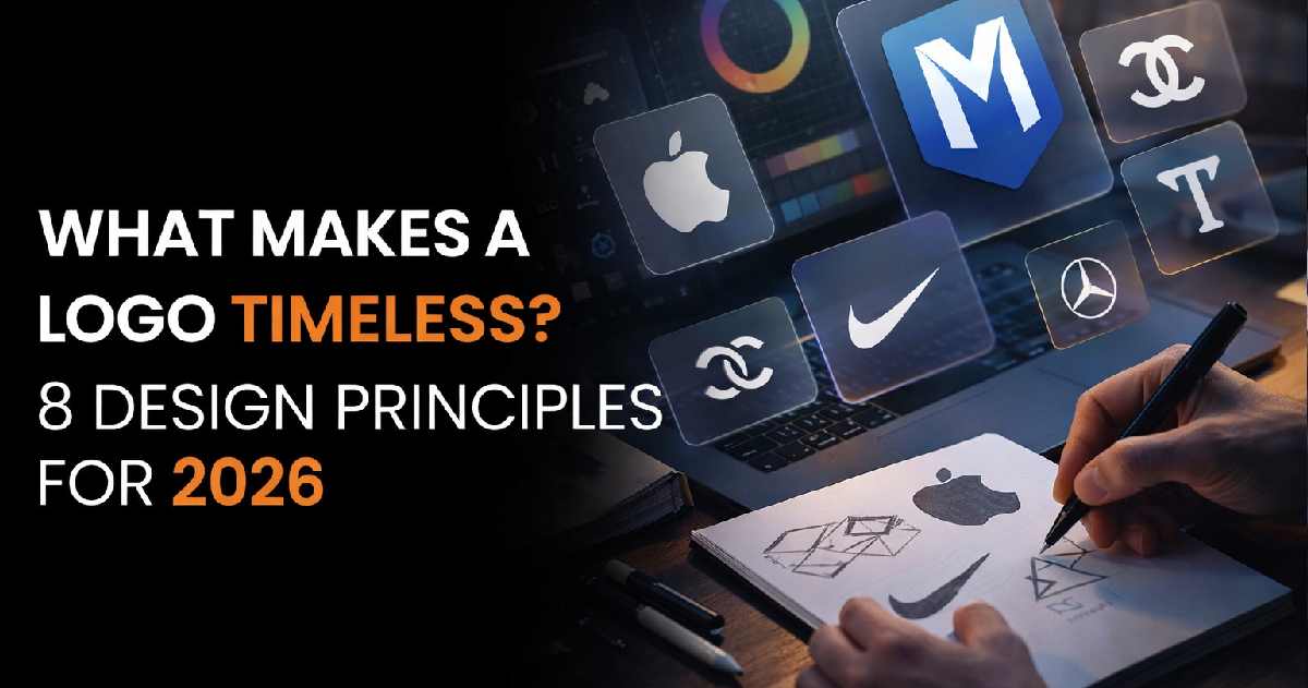
In 2026, with AI able to generate hundreds of logo options in minutes, the question is no longer “can I get a logo?” — it is “how do I get a logo that actually lasts?” These 8 principles are your answer.
Principle 1: Simplicity — Removal, Not Reduction
Simplicity is the most fundamental and most misunderstood principle in logo design. It does not mean boring. It means the removal of every element that is not essential. A simple logo is one where every line, curve, and shape earns its place — and anything that does not serve the core idea is ruthlessly cut. The simpler the shape, the more mental real estate it occupies in the brain. Squint test: if your logo dissolves into noise when blurred, it needs simplification.
Principle 2: Scalability — Every Size, Every Context
A logo lives on a 16px favicon and a 40-foot billboard. Every design decision must hold up across this entire range. Fine lines, complex details, and subtle gradients that look elegant at large scale become completely illegible at small sizes. Always test at 16px, 32px, 100px, and full display size before signing off on any logo design.
Pass: Minimum 2px line weight
At the smallest intended display size, no line should fall below 2px or it will disappear on screen.
Pass: Works in black & white
If your logo only works in color, it will fail on embossed stationery, single-color print, and black-ink stamps.
Fail: Details that merge at small scale
Fine decorative elements, thin borders, or complex illustrations that become a blob at 32px must be removed.
Fail: Gradient-dependent mark
If removing the gradient makes the logo unrecognizable, the underlying mark is not strong enough.
Principle 3: Color Psychology Over Color Preference
Color is the most emotionally loaded element in a logo. Before asking “does this color look nice,” ask “does this color make people feel what we want them to feel?” Blue communicates trust and stability — which is why every major bank and tech giant uses it. Red communicates energy and appetite — which is why fast food companies use it. Your personal color preferences are almost entirely irrelevant to this decision.
Principle 4: Typography as Personality
If your logo includes text — and most do — your typeface is not just aesthetic decoration. It is a character statement. Every font communicates personality before a single word is read. Serif fonts signal tradition, authority, and heritage. Sans-serifs signal modernity and clarity. Script fonts signal craftsmanship and personality. Display/custom fonts signal brand investment and uniqueness. Choose based on what your brand stands for, not what looks interesting to you personally.
Principle 5: Uniqueness — Originality Is Non-Negotiable
A logo that looks similar to an existing competitor is not just a missed opportunity — it is an active liability. Brand confusion leads to consumer distrust and, in some cases, costly legal trademark disputes. Before finalizing any logo, a thorough competitive landscape audit is essential to ensure the mark is visually distinctive and legally defensible.
Principle 6: Timelessness Over Trend
Design trends are seductive and temporary. The logos that last decades are built on enduring design principles: strong geometry, excellent proportions, intelligent use of space, and genuine conceptual depth. Always ask: will this look as relevant in 10 years as it does today? If the honest answer is “probably not,” you’re building on a trend, not a foundation.
Principle 7: Versatility Across All Applications
A logo must perform consistently across all brand touchpoints — digital, print, embroidery, signage, merchandise, and packaging. This means testing every logo in its intended real-world contexts before final approval. Common failure modes: a logo that works beautifully on a white website but disappears on a colored product label, or a wordmark that reads perfectly large but becomes illegible stitched on a cap.
Principle 8: Conceptual Depth — A Story Worth Discovering
The most powerful logos carry meaning beneath their surface. A hidden arrow in negative space. A letterform that contains a related symbol. A color choice that references the brand’s origin. Conceptual depth creates the “aha moment” — the instant a viewer discovers the secondary meaning hidden in the logo. This discovery triggers a dopamine response, creating a positive emotional association with the brand. The viewer feels clever for finding it. And they never forget it
“A logo is not just art. It is the strategic compression of your entire brand story into a single visual mark that must work everywhere, forever.”